Showing posts with label choosing paint colors. Show all posts

Thursday, April 14, 2011

Why hire a designer? Article on working with Rivalee!

I don't mind tooting my own horn, but this time I get the pleasure of leaving that to journalist Elizabeth Griffin who wrote the following article about her experience working with me to transform her bedroom.  My favorite part about this transformation was that all we had to purchase was the paint and the fabric for the new curtain-headboard.  Everything else was already in the home, including the extra fabric to make the new throw and pillows for the bed.  The goal was to make the most of what she owned, including the quilted bedding, and stick to a cozy budget.  We did all that and had a lot of fun in the process!  Enjoy!


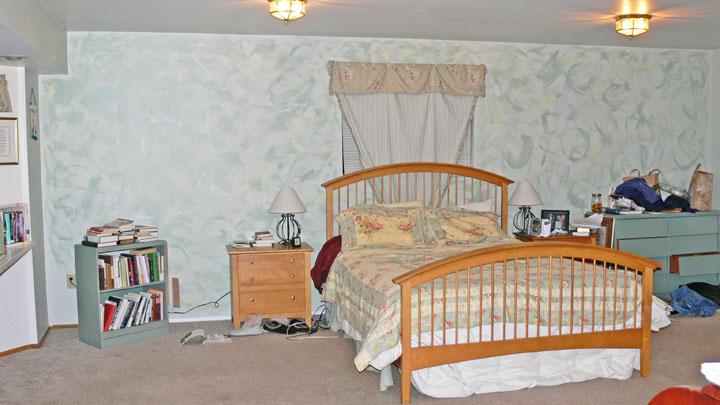
Before: faux painted walls were too pale to ground the room and pull the color out from the bedding.  The window behind the bed felt awkward, and the table lamps were too small.


After: a rich teal green anchors the room and brings out the green in the bedding.  The coral curtain eliminates the awkward window and ties to the rose colors in the bedding, further accented by the new pillows and larger, colorful lamps.  The rest of the accessories came from throughout the home, given new life through color and lack of clutter.

Bedroom transformation


From a converted two-car garage to a comfortable haven: working with a designer helped me create the bedroom I always wanted

Published: Tuesday, April 5, 2011 10:10 AM PDT
My bedroom is a converted two-car garage. Huge and awkwardly shaped, it has a total of five doors, all of which are used regularly to access places in our house and closets. I have tried to make it cozy by moving furniture around and faux painting, but have never been able to achieve the look I desired.


I have always been dubious of the claim that homeowners save money by using an interior designer. Now I see the benefit of getting it right the first time with the help of a professional. It really does save a lot of money and time, and it also helps you avoid the decorating burnout that dissatisfaction with your own choices can bring.

That burnout is what led to the mess that I called my bedroom. The place had become the dumping ground for many things in our house. Just the process of preparing for a designer to visit helped me get rid of a filing cabinet’s worth of old paperwork, treasures I have never used, and stuff that needed to be put in the attic. This alone made such a difference that I am listing it as the first reason that using a professional interior designer is a good idea.

Second on my list is the fact that within 15 minutes of walking around my bedroom and asking about the colors I like, Rebecca West, owner of Rivalee Design, told me exactly what we needed to do to give the room a cozy, warm atmosphere.

I moved from feeling ashamed to hopeful after that first consultation. “Most people live with bedrooms that aren’t what they want, and why? We wake up there and start our day there and we should love it!” West said.

She cut through my indecisiveness immediately, and, without pushing, showed me that the large windows on one wall provided enough light and the undersized, awkwardly placed window on another wall needed to be covered up. By making it disappear with a large floor-to-ceiling curtain, I had a lovely backdrop for my bed, which previously had been hard to place.

Another area of indecision and downright anxiety was overcome when West flipped through her wheel of paint colors and pointed to the perfect shade for the largest wall in the room — number three on my list is that professionals know which of 5 million color choices is the right one. Each color she chose matched a picture I showed her that included my favorite hues, which were bolder than I had the courage to use. Instead, I had decorated the room with lighter shades that left it washed-out and dreary.

“You can use color so successfully to make a big room feel cozy. A rich, dark color anchors the room,” West said.

After purchasing a gallon of the paint West recommended, I second-guessed the choice. West returned my worried e-mail with one that read, “It’s a scary color, always scary to go dark, but I am excited to see this come together for you! Make sure you do at least two coats so that you get the richness of the color coming through. Thanks for trusting me.” This is the fourth reason on my list of why to use an interior decorator. She gave me courage to keep moving in the right direction when I wanted to return to safe territory.

After completing the major work, it was time to “accessorize.” Using artwork and items that I already owned, West placed them in just the right location of the room to give them new life. I realized then that I should always go bigger and bolder than I feel comfortable with to make my décor work.

“Fewer things, but bigger, will be more successful,” West said. “Using lots of little items just turns into clutter.”

Repurposing the things that I love brought personal touches to an intimate room. Rather than taking over and doing it her way, West recognized my style and drew out of me what I really wanted all along but had been hesitant to do — reason number five to seek professional help in decorating. Because we worked together, I felt as much a part of the process as she was, and that gave me confidence for future decorating pursuits.

Basic factors in room design

Though each room is unique and the things to look at depend on the project, according to West, there are a few factors that go into every decorating renovation.

Use of the room: How do you really use the room and want to use the room, as opposed to how you think you should use the room? For example, do you want a home office in your bedroom or a television in your dining room? There is no reason to be stuck with the label of a room.

Mood desired: How do you want to feel when you’re in the room? This is where color and style come into play because they evoke the mood you want for yourself and others, depending on whether it’s a public or private space.

Decluttering: Get rid of the things that don’t belong in the room. Use fewer large objects rather than lots of little ones.

Putting the puzzle together: Once use and mood are determined and the space has been decluttered, it’s simply a matter of determining all the elements that need to go into the room, setting those up and creating it.

Figuring out the details: Accessorizing provides texture and interest. This is where the art comes in, according to West. You bring in a number of accessories and play with them, creating those personal touches that make a room feel complete. 

Tuesday, July 7, 2009

A primer on paint - what sheen should I choose?


Not only do you have to decide what color you will paint your walls, you also have to decide the sheen of the paint. The "sheen" is the shininess of the paint and has a big effect on the look and durability of the paint job. It also affects coverage (how many coats you'll need).


In general, the less shiny the finish, the more sophisticated the final look. However, the inverse is true for durability - in general, the more shiny, the more durable and washable. You should also know that the sheen can change how a color looks to your eye and may appear darker or lighter with a glossier finish.

There are four basic levels of sheen: flat or matte, eggshell and satin, semigloss, and gloss. With some manufacturers, they have both eggshell and satin (eggshell having slightly less sheen) and some also have a high gloss in addition to the standard gloss.


Flat Paint
Also called "matte," this finish is generally non-reflective (though many top quality flats still have a very slight sheen) and is the most forgiving in that it can hide surface imperfections, including scratches and small dents. A flat paint also has the greatest hiding capability allowing for fewer coats of paint.
Flat paint is a good choice for large interior ceilings and for walls in living areas that don’t get a lot of abuse. It is not recommended for areas with high humidity and water exposure. My favorite matte finish paint is Aura by Benjamin Moore - it looks like velvet in the darker colors!
Eggshell or Satin
Both eggshell and satin paint have slightly more sheen than flat, satin having more sheen than eggshell.
I use satin or eggshell on kid’s room walls, kitchen and bathrooms because they have better stain resistance than flat paints and can be scrubbed more vigorously. It also resists humidity well, though your bathrooms should still have good venting.
Satin can be a nice choice for trim if you don’t want it too shiny, and it is a great choice for exterior use since it readily sheds water and resists the effects of the sun.
Semi-Gloss Paint
The next highest sheen, semigloss, is even more resistant to dirt and scuff marks, and easier to clean. It’s traditionally used in kitchens, bathrooms and on trim, windows or doors. As satin paints have improved I don’t tend to use semigloss on walls any more because it looks a little too plasticky to me and really highlights imperfections in the walls, so I reserve it for trim, windows and doors. Still, it can be a smart choice for a kid’s bathroom.
Gloss Paint
Gloss paint it highly reflective, very tough, more stain resistant and easier to clean than any lower paint sheen. Because of its highly reflective nature it will really highlight surface imperfections. Gloss paint can be used on trim, doors and windows, but choose it carefully as this type of paint will produce a "plastic" coated look on smooth trim and doors. That can be great if it is the look you want.
Other notes
This information all refers to water based paints. Some people really prefer to use oil paint for doors, windows and trim as it is more durable and because it dries more slowly, brush marks have time to even out. Bear in mind that oil paint is much more toxic and must be used in a well-ventilated area, and that it must be cleaned up with spirits instead of just water. Anther option for that higher durability is to choose a latex "enamel" - these have more binder content than other types of finishes and so are harder, more stain and scuff resistant ,plus are more washable than other interior finishes.
This information is also meant for guidance on painting the interior of a home, but each paint sheen is also available for exterior use. I recommend a satin sheen for exterior walls because it sheds water well, but still looks sophisticated. Just keep in mind that the shinier the paint, the more it will shed water and resist dirt pick-up. For exterior trim you can stick with satin, or go to a semi gloss or even a gloss.
The ability for a paint to hide an existing color is directly affected by the sheen of the new paint. In general, flat paint covers the best, gloss the worst. So, say it takes two coats of flat paint, you’ll want three or more coats of semi-gloss or gloss for perfect coverage.
Remember that every manufacturer will have a slightly different definition of each sheen, so be sure to look at the samples for the specific brand you are buying before committing to a given sheen. The samples on paint chips are usually given in a flat sheen.
Happy painting!

Thursday, March 26, 2009

Use "caution" when decorating with yellow


Alley, before consulting with Rivalee Design,
 says "Caution" instead of "Welcome"


Alley, after working with Rivalee Design,
repainted in cayenne red and butter yellow.


Yellow may be the most cheerful color on earth, but while nature usually gets yellow right, we humans often botch the job.  What is so hard abut successfully decorating with yellow?  

When I first visited the job site pictured at left I was discovered a screaming yellow that said "CAUTION DO NOT ENTER".  Choosing yellow to brighten a dark alley was not a bad choice, but the shade and intensity were all wrong.


When I created the new palette, I still incorporated yellow, but the yellow I chose looked nearly white on the paint chip.  That is one of the keys - remember that colors intensify as they cover more space and as it reflects itself.

So then how can you successfully decorate with yellow?  Here are three tips to help you bring that sunshine inside.

1. Avoid “yellow”

Choose a color more like sand, or creamy butter.  If the paint chip looks like the yellow of a crayon or daffodil, the color is way too intense for the walls.  

2. Add splashes of yellow

If you are determined to incorporate sunny crayon yellow, start small. Try a soft grey sofa with daffodil yellow pillows and a lemony throw.  Set the table with a dragon red tablecloth and deliciously yellow plates.Try new navy curtains with sheers in sunny yellow. Or add a collection of bright, shiny yellow vases to the room.

3. Use only yellow

When decorating with a bold color, using a monochromatic scheme can make it work.  If you paint the walls a medium shade of yellow, lay blond wood floors with white area rugs and hang white curtains, then splash around some intense yellow accents, the result can be sunny, lovely, and bright.

One little warning...

Whatever variant of yellow you choose, it’s likely to shock you as it goes on the walls.  Don’t panic.  The wall color is only one layer of the decorating in your room.  Try not to make a final decision on the color until your furniture, rugs, art and accessories are in.  This is especially true if you are hiring a decorating professional to create a room for you.  That person isn’t just giving you a paint color, they are giving you a whole room.  


Here’s how it was said in Martha Stewart Living: “Hold that breath when you've finished your walls, and don't exhale until the furniture goes in, for yellow is hot or cool... depending on its neighbors; nothing's as qualmish as an empty yellow room.”  


Well put, and good to remember.